Thursday, 13 October 2011

My favorite piece of Motion Graphics!

The Littlest Elf - Loverly Spring


This is a little piece of motion graphics I discovered a while back when I was a preteen and had a celebrity crush on Klaus (Liam Aiken) in the movie: Series of Unfortunate Events. The movie starts with this motion graphics piece where we see a few opening credits. For those of you who haven't watched the movie, it's based on Lemony Snicket's famous children novel series. The series (Series of Unfortunate Events) focuses on the depressing lives of 3 orphan siblings. Therefore, starting the movie with this too-happy, cheery clip added a creative contrast that entertained viewers.

Unfortunately, it doesn't seem to have been successful since they stopped re-making the 13-book series into movies after the very first one. It's a shame because despite all the negative qualities in the movies, I believe the aesthetic design elements were great and creative in the movie, as seen through this introduction. I also liked the actors, especially my favourite, Jim Carrey!

I'm not sure if the environment and characters were hand-made or completely animated (maybe both?) but I love how it looks. It's got this warm, arts & craft feel. The characters look like it's been made of some kind of play-dough. I'm thinking of perhaps crafting my stop motion piece in this style if I could.

I love this piece because there are so many cool and vivid elements (music, effects, cool typeface, colors) that blend together and balance very nicely. The successful use of design in all aspects makes this an overall charming and funny piece. This story of the little elf puts a smile on my face everytime and I really get drawn into this little village every time I watch it!

PS I'm sorry my other posts were so long - but I made this one shorter! :)

- Karoline
(week 6)

Tuesday, 4 October 2011

Artist Statement - CD Cover


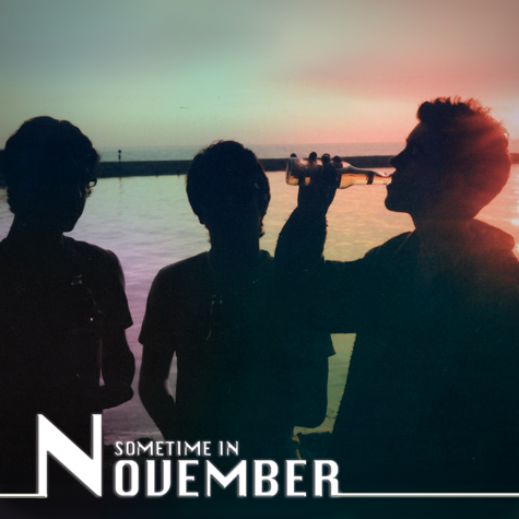
This is my album cover!

Before I start, just want to clear up something about the band name. I used the name "Sometime in November" for no reason - it was the first name that came to mind and its the name of my uncle's band*! The cover was NOT inspired by their music. Just a name!

So....
I took this photo this past summer in Wasaga beach (Prom after-party weekend) with a pentax k1000 film camera. Film is my favourite to shoot and the pentax k1000 is amazing. I took it during the day but since the sun was behind my three friends, they all became silhouettes. There was nice contrast that really gave the picture a relaxed, youthful mood. This is why I believed it was a good start for a cd cover.

I scanned the image onto photoshop and cropped it to square, so the three guys are pretty much centred. I selected various parts in the image and adjusted (and feathered) colours.  I picked vibrant pastel colours and tried to pick and blend them together as best as possible.

At first I was going to keep the original hue in the sky but I felt it needed something else. I decided to experiment, so I added the colours. I believe the colours give the image a psychadelic mood. The relaxed stance of the 3 guys, the burst of colours in the background, and the white text all contrast with each other and I hope to have positioned them all well. I also tried to play with lines so I added the strip at the bottom. Basically, I hope that overall it is a well-balanced cover.

TARGET AUDIENCE....
I wanted this kind of cover to reflect a band that plays music in the genres of classic, soft, indie rock, perhaps somewhat electronic - kind of like MGMT, who is quite eclectic. Perhaps songs influenced by classic rock songs, just generally older hits from the 70s. The typeface kind of reflects the electronic aspect - there is a 70's vibe in the photo but the typeface also modernizes it a bit.

As mentioned before, the relaxed posture of the silhouettes and the colours give it an overall mood... these are words that come to mind for me: youth, easy going, 70's vibe, psychedelic, party or post-party, summer nights, chill, friends.

In the critique, one of my classmates said that at first she wasn't sure whether she liked the white line across the album cover, but she then changed her mind. I was the same - I tried it out and I wasn't too sure about whether it fit well, but I decided to go with it anyways and I do like it now.


* Check out my uncle's band, "Sometime in November"
http://www.sometimeinnovember.com/
http://www.youtube.com/user/SometimeInNovemberCA


-Karoline
(week 5)

Sunday, 2 October 2011

My CBC 75th Anniversary Volunteering Experience!

This Saturday I was granted a volunteer position at the 75th Anniversary CBC Open House - It was an awesome experience!

All volunteers were assigned different areas to work in. My friend and I (Lydia, also a 1st year RTA student) was assigned to work at the News Desk station. Here, guests participated in short mock news broadcasts including news, sports headlines and weather. It went in groups of three. When the next group was up, each person would go to their spot (sports and news at the desk, and weather standing in front of a green screen) and perform their newscasts with teleprompters. It was so professional and the script was actual news from the day before! The crew recording each take and we took the footage and converted the files onto cool CBC-themed usb keys so they could take theirs home and show family and friends. It let guests experience the real thing and everyone had loads of fun. I had a great time meeting people: guests, other volunteers, other CBC workers and featured anchors and news reporters who took part in meet-and-greets with the public. 


Funny story:
I met Odette Gough (photo on the left) one of the presenters of Le Téléjournal, which is considered the French language equivalent of the English CBC's The National. She was so friendly and talked to me and my friends. She told us about her musical career and my friend told her that I sang opera. So... she made me sing opera right on that spot in front of everyone! It was extremely nerve-wracking but it was funny. Odette's friend asked me to join her french choir - which I totally would have but it was too far for me to commute. 


My own footage... I filled in a couple of times when certain groups didn't have three members. It's a lot harder than it looks! Lydia (right) and I (left) jumped in without having looked over the script and we were pretty terrible!

Volunteering for the 75th CBC Anniversary Open House was such an amazing experience. In the media industry it's so important to know people, and I definitely met a lot of people thanks to RTA. Two of my fellow volunteers and I even charmed the lighting director into giving us an all-access tour of the building! We got to climb around the sets for the children's shows, peek in on a live taping of Cover Me Canada, and sit behind the Hockey Night in Canada desk. It was definitely a surreal day and the volunteers were treated so well.


- Karoline
* thanks to http://www.lexpress.to/archives/3790/ for the picture of Odette Gough!

Thursday, 29 September 2011

Target Audience

This entry will focus on a thought I developed after my digital media lecture this morning... So far, an important consideration I must make in all of my RTA classes and all productions I create is being aware of TARGET AUDIENCE.

Things to keep in mind when designing: typeface, size, colour, graphics, content. I learned this in week 3 but we talk about target audience in every class. Anyways, the choices you make in these elements will attract a certain target audience/demographic.

Let's see 3 examples... of cd cover designs! (I'm currently in a musical mode).
Let's compare three album covers which all feature a close-up of a female artist.

1. Hole (Courtney Love)

1. Typeface - Album from 1994 but the typeface reminds me of the 70s, retro feel
2. Size - Close up of face expressing happiness, bliss, excitement.
3. Colours - Warm colours - makes me feel happy, fade colours give it an older feel.
4. Graphics - Only focus on courtney love's face - which greatly contributes to target audience. She's wearing a crown, holding flowers, her make-up seems to be smudged. Mouth open hide in joy.
5. Content - Well balanced design.

Personally, through the design of this cover I could see that the target audience is:
teenagers who like to have fun, party, who are or wish to be free spirited. Looks like a party. It looks like her makeup is running - showing intense emotion. A 70's feel attracts a broader audience - people who enjoy older rock hits. It's appropriate that Courtney included these retro elements since many of her songs are inspired by classic rock artists and she puts her on grungy attitude on top of it. Her confidence shines through her photo - her music was quite different among the other music in the 90's, especially since it was coming from a girl. The cover is well-balanced - the graphics are quite extravagant and eye-catching and the title does not clash with t because it's simple with a girly edge that reflects the feminist elements in her music.


2. Taylor Swift

1. Typeface - Delicate, feminine, twirly
2. Size - Again, just her face. Natural makeup, rested facial expression. Typeface is a good size.
3. Colours - Very natural
4. Graphics - Butterflies, background patterning
5. Content - A lot of detail/textures going on but it's pretty balanced. I just don't like the background because her curly hair doesn't blend well with the background - she's clearly put out and pasted on top of it.

All of these elements are very feminine so they will attract that audience. Taylor showcases herself with natural hair and makeup and the overall effect is purity, innocence - therefore, I believe that most of the audience would be young, perhaps in their preteens and early teens. The nature feel in the cover found in the water, earth, butterfly elements and her slight glowing tan reflect her country music genre, attracting country fans. Very innocent. I think it is mainly aimed for girls and teenagers, but it is obviously open for anyone to listen.


3. KE$HA

1. Typeface - Bold, hard, scratchy, edgy.
2. Size - Typeface is also capitalized and in yellow - very noticeable.
3. Colours - Dark elements contrasting yellow/warm colours
4. Graphics - Random touches of lines and specks to add to the edginess
5. Content - Below

Her expression is a lot different compared to taylor swift's innocent smile and courtney love's huge grin. Ke$ha's expression is serious, sexual, and shows power and attitude. It's also edgier than the other two. However, I also see similarities between courtney's and ke$ha's. Kesha and Courtney shows dominance while Taylor seems vulnerable.
Anyways, the combined elements of this cover show that the album is aimed for edgier teenagers who perhaps are also free spirited, independent, want to rebel, and/or enjoy hard partying/clubbing/concerts/etc.

The idea of target audience connects through all of my classes this term - audio production, media writing, english, digital media, media tech theory, and even biology.

-Karoline
(week 4)

Thursday, 22 September 2011

CRAP.

THE "CRAP" PRINCIPLES OF DESIGN
(Contrast, Repetition, Alignment, Proximity)

Hey! Today I will be analyzing images that embody certain CRAP principles of design.


1. CONTRAST


One of my favourite movies! I recommend it.
This is the Shallow Hal movie dvd sleeve.  I think this is an awesome example of effective contrast. Contrast is found in the colours used - mainly blue and yellow (primary colours), the font size and width in the title. I'm glad they stayed consistent in the font because it's an uncommon typeface for a movie. The font works for the movie content though. A nice play with lines (horizontal/vertical/diagonal). There is contrast between textures (ex. brick wall vs the rest, smooth). The two featured characters even contrast with each other in shape and colour (clothing, hair). Overall, there is a nice emphasis of contrast elements in the overall design that makes it successful! There is also effective repetition of the typeface and colours used. The paragraph alignment of the words in the description section gives it a humorous feel since it is usual and informal and also draws attention to the humorous image it is working around.


2. REPETITION


I browsed through Abercrombie today at the eaton centre - the first time in years!
This is why I chose Abercrombie to represent "repetition". 
Design is effective when one aspect is repeated throughout the page(s). This can refer to typeface, shape, stroke thickness, colour - anything visual. Throughout the website, the title logo"Abercrombie and Fitch" is placed and hidden everywhere in their website and posters, the font size varying in shape. I know that it's the title and it should be everywhere, but the fact that the size varies and the amount that is shown also varies, shows that it is repeated effectively throughout and ultimately, keeps it interesting. I've got to say that the proximity of the website is great as well. Very easy to navigate. Also, obvious black/white colour repetition and font size bring contrast to the pages. One may argue it is boring but I think the black and white is a classic contrast and it gives the website and brand a classy, high-quality and elegant feel. The makers were probably aiming for this even though a lot of their clothing is casual.

            
3. ALIGNMENT


This is also one of my favourite movies!
It is important to align items on the page appropriately to create visual cohesion. Find a common alignment! Also, typeface should stay consistent. Centre alignment should be avoided. This is because it's more difficult for the reader since new lines start at different areas each time. 
However, I believe that the centre alignment works for this movie poster. The sentences are simple and short. All the lines are around the same length, making it easy to read for the reader. A possible reason as to why this centre alignment was used was to reflect the robot boy's mind. He is like any other young boy... simple and he has the same feelings but is unfortunately trapped in the life of a robot which complicate the plot and evokes many conflicts in the movie. He is so much more than he is perceived to be and experiences strong feelings. Therefore, the simple arrangement may also show what he is perceived to be by others. Anyways, that is up for debate but bottom line, in terms of design, I think the alignment of type is effective and all other elements work together to create this successful poster. I believe the poster is very simple yet intriguing. Great contrast found in the poster, between the font sizes and colour (silver on top of black). I personally find silver on black a bit dull but I believe they chose silver to demonstrate the "metallic" feel of the futuristic setting of the movie.


4. PROXIMITY


Grouping related items together - Promixity. In other words, Organization! Doing this will create overall cohesion and organization between content and the overall design of the poster/image.    
I like this wedding menu. I think it's well balanced and the visual tone is effective. The different font sizes and grouping makes this an easy and pleasent menu to read. I really like the image around the top because I find wedding menus to be quite boring without a pop of colour like in this one. There is one thing I would change though - the typeface isn't consistent. It's not that bad but it kind of bugs me. I also believe that the font used for the food descriptions are too fancy and swirly - It's hard to understand, especially when the font is used a few lines at a time! The message gets lost.
.........................................................................................................................................


The CRAP principles have taught me a lot. I was making some mistakes in the past that I will now know how to fix and I feel confident to go even further with my designs. I believe that the principles ultimately helps you achieve balance. This results in pleasing aesthetics, simple and smooth navigation. These elements should be taken into consideration as the success of designs are crucial in attracting the public. You want the public to remember you!


- Karoline 
(Week 3)

Thursday, 15 September 2011

My Digital Footprint!

This week I learned about digital footprints.

A digital footprint is basically one's online identity formed through their digital traces or memory of their time online. The internet is a constant and rapidly growing media - a enormous network filled with accessible data, and because of this accessibility, it allows future employers to determine the apparent type of person you are! They can look you up on google and search through what you have made public: such as various social media networks and your interactions within websites. This could determine whether you get hired somewhere - so shouldn't you be careful?! YES.
This class taught me so much: it made me aware and has motivated me to take action in making my online identity the best it could be! And I'm excited to start!

What I found....

What I liked!
So I looked myself up on google. Luckily, I'm one of the few Karoline/Karolina Podolaks out there so I did find some information about myself. I've found a few articles about a few photography contests I won (not to brag... hehe), a couple youtube videos I made by myself as well as with friends, samples of poetry for a CD I was recorded in. I also found the URL to this blog and credits to my fashion photography. Check it out if you'd like! I also found a few pictures of myself on images thanks to myspace (I totally forgot I even had one...)
Unfortunately, google results vary between Karolina Podolak (Birth name) and Karoline Podolak (What I go with) so employers would most likely only see what I was credited for as "Karoline".

What I didn't like...
I found links to comments I made on facebook groups which were pretty random. So I just wanted to clean them up. I logged on and deleted most of them, especially ones from when I was in grade 9/10, which were pretty obnoxious.
Funny story: I found a pair of parrots in my backyard two years back. I wanted to give them back to their owners because they were gorgeous birds, so I announced a post about these parrots on a regional lost and found pet website. Well, the owners of that website distributed my post to a bunch of other related websites. So when I looked my name up on google about 2 years ago, there were about 10 links to my "FOUND 2 PARROTS" announcement on different websites! People were even discussing about my post! I had to contact each website and ask them to take the posts down because I found their owner long ago!
The original post is on there though... pretty funny actually: http://www.parrotsnow.com/found-2-parrots.html

Anyways, to improve my digital footprint/online identity, I'm going to take these steps:
1) Create a flavors.me portfolio!
2) Create a google profile
3) Buy my own domain name!
4) Start a youtube channel. I'm really excited for this. I'm going to upload classic rock covers (me singing and playing the guitar), vlogs, fun video projects/skits, and some interesting secret talents I have.... (You'll see!)
5) As stated before, delete some of my activity on Facebook so it doesn't show up on google. My activity isn't bad or anything - I could just do without it. I know it's always going to be in Facebook history but at least it'll be off google... at least I hope so.

Considering my decisions and plans, I think we should all take action to create our own positive digital identities. We have the power to do so and who knows, this can help with our careers! You'll look great and plus young adults who are active and knowledgable in social media platforms are great resources for many industries. However, when it comes to opening up about your personal matters - don't do it. And NEVER share rude and negative thoughts and comments - it's offensive anytime and will get you nowhere. Besides that, take this opportunity to flourish your online identity! Leave a good mark.

I feel in control.


- Karoline
(Week 2)

* I got this image from: http://optimizedstrategies.com/publications/how-to-guides/10-steps-powerful-online-digital-footprint/ - Thank you!

Saturday, 10 September 2011

Volunteering at the 26th Gemini Awards!

One thing has become very apparent to me since I've started RTA: Donna sends a lot of emails. Some of the emails are about important RTA info and events and a lot of them are amazing volunteer experiences! As soon as I got the e-mail about the Gemini Awards, I replied ASAP - I want all the volunteer experience I can and this sounded fun and it sure was!


So, during the first few days of school, I was already granted a volunteer position for the 26th Gemini Awards as a stand-in and audience intern - It was an amazing experience. I volunteered the 6th and 7th of September (the actual show), therefore, I actually got to join the crowd and watch the show. All that just a few days into the RTA program.. Well, what a great start and taste of the industry I got!

I got to meet a lot of great people: fellow volunteers, CBC workers, guests and even some of the artists. It was my first time inside the CBC building and the set was incredible. I hope to volunteer next year. Honestly, I hope to volunteer and hopefully work for related events as much as I can throughout my studies at Ryerson.

FUNNY STORY: 
All celebrities had a specific seat assigned to them, so the cameramen would know where they were if they won. Therefore, before the show, the seats designated to specific celebrities had a photograph of the celebrity on it. At one point during the day, I was sitting in a regular seat beside one with a picture of Rick Mercer on it. I rested my arm on this chair, so my arm was basically on Mercer's head. I was just in a gaze, daydreaming about something I forget, until I felt someone looking at me. It was Rick Mercer himself, giving me a funny look! I laughed and took my arm off his head (well, the photo) It was a funny moment. He came in early like some guests during the rehearsal process.

another funny story....
During the show, Tom Green was in a room full of cheese worth a total of $7000! At the end guests ate cheese and so did the volunteers! There were so many leftovers that I brought home a block of $200 cheese along with other cheese my family enjoyed. Hey, they had to go somewhere - I didn't want them to throw it in the garbage! 

Anyhow, as you can see, I really enjoyed these few days and I am so thankful!

-Karoline 
http://country94news.blogspot.com/2011/09/its-not-whole-lot-of-info-but-according.html - thanks for the picture of Rick Mercer!
http://ohinternet.com/Tom_Green - thanks for the picture of Tom Green!