Thursday, 10 November 2011

Showing you my motion!

Hey! This is my update to you about how my motion graphics assignment is coming along! So far I have the elements needed to create my motion graphics - that's the photos and my audio. I will need to create some animation but that will be on the program. 
I have the audio I made in class using the sound effects from the iTunes library. I want to upload it on here but I cannot upload mp3 files unfortunately. It's 4 scissor cuts for each photo sequence and then girls laughing until the end, when the devil tail and horns appear on the centred cutout doll. For my title I will try to animate it as if I'm writing it on. I may need to add audio for that so before I render the entire movie I'll edit and add to the audio files to fit the video. 


Those are samples of 2 of the photos I'm going to use. The colouring is faded so I will need to use the burn/dodge tool to increase the contrast. First, a little history behind these photos. Looks like it would be simple to shoot and get the footage but you are wrong. I'm a photographer but for some reason I was having a lot of problems with this part!

So I started off with sequencing 4 photos I took at home. I used a black bristol board and made cutout girl dolls out of white printer paper. The 4 photos were really annoying shoot because I couldn't find my tripod for the first few hours at home so whenever I had to take the next photo, I was always shooting from the wrong angle. After trying for like an hour, I got the 4 photos and it looked cool because the lighting was different ever so slightly, giving a cool stop motion effect, and then.... I accidentally deleted the last one - the most difficult to get right. And I already cleaned up my workplace! I didn't want to spend another few hours to redo it so I really searched for my tripod and I found it.

So I wanted the cutout dolls in the photo to be in the same general area and have the lighting to be different ever so slightly (as stated before) but I realized I could just change the lighting values in photoshop so that didn't concern me. Well, I got the 4 new photos quickly and I was finally happy! I moved the dolls around a very tiny bit in each photo to give it a cool motion graphic effect. I'm happy with the positioning. 

To be honest I'm kind of scared right now. I have my elements but since after effects is new to me I'll have to figure out a lot of stuff on my own - the thing that's concerning me most right now is the animation aspect - the devil tail, horns and the title. You'll see how it goes. It's crazy how by Tuesday it'll be done - I have no idea how the final product will look!

- Karoline
(week 10)

Friday, 4 November 2011

COLOUR

Hey, so this post is about "blogger's choice" so I decided to expand more on colour and its importance. I'll also show you some examples. I had a colour lecture in the beginning of the semester, but I'm also talking about it again in my media tech class, which is why I decided to discuss it once again. I've always loved visual arts and managing colours. Anyhow I'm going to put up 3 cd covers that I believe effectively used colour.

1. MGMT - Time To Pretend

I believe this is an excellent cd cover and the colour is great. There is a focus on pink/red tones with splashes of blues and yellows. Therefore, as you can see, the primary colours are shown in the cover. I like the fact that there's a lot of patterns in which the different shades of these colours are shown. I really like the type used for the title and the fact that it is simply outlined thinly in white. It balances the photo. The position and colours found in the title and the subjects make both elements equally noticeable - not just one over the other.
2. Deep Purple

I personally love posters/covers that include the classic black and white contrast element while adding in colour on just the subject. This is a cool, abstract cd cover and the fireball is the only thing coloured. It's coloured with 3 main colours, that are triads. A triad is 3 equidistant colours on the colour wheel which results in a colourful, yet balanced scheme. In this case, the three colours are yellow/ orange, purple/pink and blue. Overall I also think this is a very balanced cover in terms of placement and colour.


3. SPICE GIRLS

This CD cover has a lot of colours going on, but I can see where the producers wanted the main focus to be. The first focus is in "SPICE", where they use large font and the primary colours in slightly varying shades. The additional first focus is the 5 girls, dressed in many different colours but since the background s white and the girls are small, I think the fact that the girls wear colourful clothing gives the cover a playful feel and the business adds to it. The colours really appeal to a fun, pop-loving audience.


- Karoline
(week 9)

Thursday, 27 October 2011

After Effects & My Work

As of a few weeks now, my class moved on from photoshop and started After Effects!
I'm happy to finally be able to work with this program. For years I kept running into ideas for videos and I never had the program to do any of it! (The programs are expensive and I didn't have a good computer for it).

That being said, I'm excited to keep learning. I'm going to apply my knowledge into my own youtube videos, coming soon! So far, it's pretty straight forward. I pity movie-makers who lacked helpful programs like After Effects in the past, since the program is easier than I thought - you mark with your keynotes and After Effects does everything in between.

I'm doing my motion graphics assignment on the classic movie: Mean Girls. From the start, I had a clear idea but it took quite some time to decide on the final idea because I kept thinking of alternate ideas that revolved around the same topic. The topic/idea I'm focusing on is dominance, since these mean girls were obviously dominant.

I'm going to incorporate girl cutouts that grow... you'll see what I mean when the product is finished. At the end, the girl in the centre will grow devil horns and a devil tail to show her evilness. So far I've got my audio and the vision of it in my head. Excited to put everything together and hopefully I won't encounter too many problems!

I'm glad that we were able to pick any movie/show/etc. to promote, since we are familiar with what we choose and probably enjoy it a lot. It was same with our photoshop cd cover/poster assignment. That's a reason why I enjoy this class!

- Karoline
(week 8)

Thursday, 20 October 2011

What's Your Type?

AMADEUS.
The typeface in this dvd cover seems to be Times New Roman or something similar. The typeface is formal and elegant, reflecting the setting of the movie and also appealing to the target audience, which are older adults. Older as in probably 30 and up. However, I'm 18 and this is personally one of my favorite movies, probably because I grew up with it. I know many people my age who can never get through the movie without falling asleep!
Back to the topic. The letters are straight and toned down, different and plain compared to some outrageous and curvy movie cover typefaces. However, the typeface is definitely suitable because there is a strong contract of white on black and the type is large, bold and almost centered. The first and last letter are larger than the rest to add that little extra it would have needed. The typeface is consistent throughout the poster, which is good. There are few keywords on top that are small and lead into the huge typeface of the title, creating further contrast.
* got this movie poster from http://ca.movieposter.com/poster/MPW-18717/Amadeus.html - thanks!
 
THE BREAKFAST CLUB.
The typography in this movie poster is meant to look as if it were written by chalk, since it is on top of a chalk board (duh). The font doesn't seem to be written by a teacher since it is casual and curvy and very large. Therefore, the font is most likely meant to be appear student written, which is suitable since the major target audience of this movie are high school students. The typography is effective since it clearly addresses the target audience. Also, the large size of the type across the blackboard provides an appearance of rebellion and dominance, which are themes in this movie. 
* got this movie poster from http://www.amazon.com/Breakfast-Club-Flashback-Emilio-Estevez/dp/B001AEF6BI - thank you!


MOULIN ROUGE.
The typeface in this DVD cover are capital, tall, letters. The letter's color is light yellow, like lights, and there are even vegas-style lights aligning each letter. It's literally an attention-seeking typeface, which works with the themes in the movie. These typeface qualities suggest that the movie may be set in the city, in an entertainment district or venue. The typeface also gives off an energetic feel. I believe that the typography is effective because it clearly clues the audience into the mood, setting, and perhaps plot. The target audience are people over the legal age and perhaps late adulthood since the typeface gives off a feel of nightlife, entertainment, casinos, sex, and so on.
* got this movie poster from http://www.moviegoods.com/movie_poster/moulin_rouge_2001.htm - thanks!

- Karoline
(week 7)

Thursday, 13 October 2011

My favorite piece of Motion Graphics!

The Littlest Elf - Loverly Spring


This is a little piece of motion graphics I discovered a while back when I was a preteen and had a celebrity crush on Klaus (Liam Aiken) in the movie: Series of Unfortunate Events. The movie starts with this motion graphics piece where we see a few opening credits. For those of you who haven't watched the movie, it's based on Lemony Snicket's famous children novel series. The series (Series of Unfortunate Events) focuses on the depressing lives of 3 orphan siblings. Therefore, starting the movie with this too-happy, cheery clip added a creative contrast that entertained viewers.

Unfortunately, it doesn't seem to have been successful since they stopped re-making the 13-book series into movies after the very first one. It's a shame because despite all the negative qualities in the movies, I believe the aesthetic design elements were great and creative in the movie, as seen through this introduction. I also liked the actors, especially my favourite, Jim Carrey!

I'm not sure if the environment and characters were hand-made or completely animated (maybe both?) but I love how it looks. It's got this warm, arts & craft feel. The characters look like it's been made of some kind of play-dough. I'm thinking of perhaps crafting my stop motion piece in this style if I could.

I love this piece because there are so many cool and vivid elements (music, effects, cool typeface, colors) that blend together and balance very nicely. The successful use of design in all aspects makes this an overall charming and funny piece. This story of the little elf puts a smile on my face everytime and I really get drawn into this little village every time I watch it!

PS I'm sorry my other posts were so long - but I made this one shorter! :)

- Karoline
(week 6)

Tuesday, 4 October 2011

Artist Statement - CD Cover


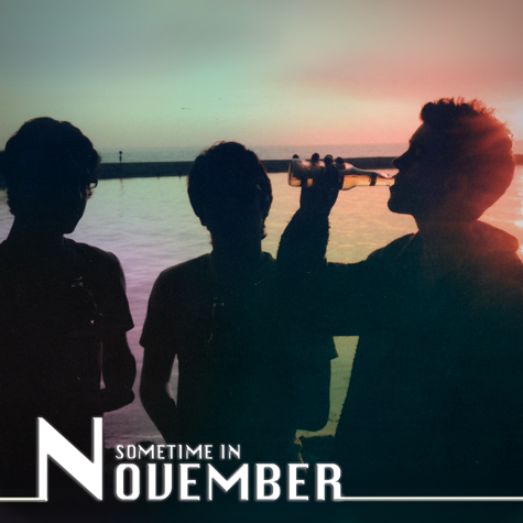
This is my album cover!

Before I start, just want to clear up something about the band name. I used the name "Sometime in November" for no reason - it was the first name that came to mind and its the name of my uncle's band*! The cover was NOT inspired by their music. Just a name!

So....
I took this photo this past summer in Wasaga beach (Prom after-party weekend) with a pentax k1000 film camera. Film is my favourite to shoot and the pentax k1000 is amazing. I took it during the day but since the sun was behind my three friends, they all became silhouettes. There was nice contrast that really gave the picture a relaxed, youthful mood. This is why I believed it was a good start for a cd cover.

I scanned the image onto photoshop and cropped it to square, so the three guys are pretty much centred. I selected various parts in the image and adjusted (and feathered) colours.  I picked vibrant pastel colours and tried to pick and blend them together as best as possible.

At first I was going to keep the original hue in the sky but I felt it needed something else. I decided to experiment, so I added the colours. I believe the colours give the image a psychadelic mood. The relaxed stance of the 3 guys, the burst of colours in the background, and the white text all contrast with each other and I hope to have positioned them all well. I also tried to play with lines so I added the strip at the bottom. Basically, I hope that overall it is a well-balanced cover.

TARGET AUDIENCE....
I wanted this kind of cover to reflect a band that plays music in the genres of classic, soft, indie rock, perhaps somewhat electronic - kind of like MGMT, who is quite eclectic. Perhaps songs influenced by classic rock songs, just generally older hits from the 70s. The typeface kind of reflects the electronic aspect - there is a 70's vibe in the photo but the typeface also modernizes it a bit.

As mentioned before, the relaxed posture of the silhouettes and the colours give it an overall mood... these are words that come to mind for me: youth, easy going, 70's vibe, psychedelic, party or post-party, summer nights, chill, friends.

In the critique, one of my classmates said that at first she wasn't sure whether she liked the white line across the album cover, but she then changed her mind. I was the same - I tried it out and I wasn't too sure about whether it fit well, but I decided to go with it anyways and I do like it now.


* Check out my uncle's band, "Sometime in November"
http://www.sometimeinnovember.com/
http://www.youtube.com/user/SometimeInNovemberCA


-Karoline
(week 5)

Sunday, 2 October 2011

My CBC 75th Anniversary Volunteering Experience!

This Saturday I was granted a volunteer position at the 75th Anniversary CBC Open House - It was an awesome experience!

All volunteers were assigned different areas to work in. My friend and I (Lydia, also a 1st year RTA student) was assigned to work at the News Desk station. Here, guests participated in short mock news broadcasts including news, sports headlines and weather. It went in groups of three. When the next group was up, each person would go to their spot (sports and news at the desk, and weather standing in front of a green screen) and perform their newscasts with teleprompters. It was so professional and the script was actual news from the day before! The crew recording each take and we took the footage and converted the files onto cool CBC-themed usb keys so they could take theirs home and show family and friends. It let guests experience the real thing and everyone had loads of fun. I had a great time meeting people: guests, other volunteers, other CBC workers and featured anchors and news reporters who took part in meet-and-greets with the public. 


Funny story:
I met Odette Gough (photo on the left) one of the presenters of Le Téléjournal, which is considered the French language equivalent of the English CBC's The National. She was so friendly and talked to me and my friends. She told us about her musical career and my friend told her that I sang opera. So... she made me sing opera right on that spot in front of everyone! It was extremely nerve-wracking but it was funny. Odette's friend asked me to join her french choir - which I totally would have but it was too far for me to commute. 


My own footage... I filled in a couple of times when certain groups didn't have three members. It's a lot harder than it looks! Lydia (right) and I (left) jumped in without having looked over the script and we were pretty terrible!

Volunteering for the 75th CBC Anniversary Open House was such an amazing experience. In the media industry it's so important to know people, and I definitely met a lot of people thanks to RTA. Two of my fellow volunteers and I even charmed the lighting director into giving us an all-access tour of the building! We got to climb around the sets for the children's shows, peek in on a live taping of Cover Me Canada, and sit behind the Hockey Night in Canada desk. It was definitely a surreal day and the volunteers were treated so well.


- Karoline
* thanks to http://www.lexpress.to/archives/3790/ for the picture of Odette Gough!